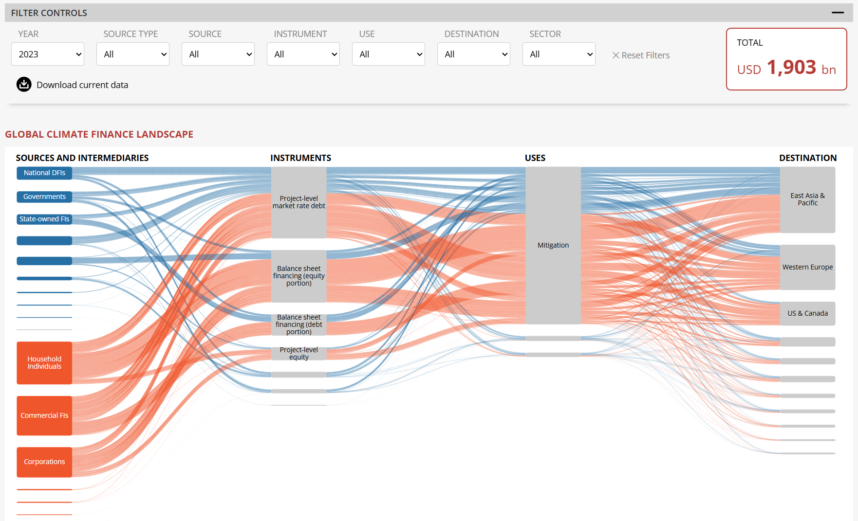
Together with the Climate Policy Initiative (CPI), I developed an interactive dashboard to explore the annual global climate finance data collected by CPI.
The dashboard allows filtering and drilling into various aspects of the data, like where each finance flow comes from and what it is used for. What made this project special was that the dashboard had to be embedded in a WordPress page without relying on further frontend frameworks like Svelte or React.
In the end, I was very delighted with the final statement I got from Pauline Baudry, Senior Design Associate at CPI, who I worked together with the closest on the project: "We are thrilled with the result of the data dashboard produced with Benedikt. The interactive sankey diagram brings CPI’s Global Landscape of Climate Finance data to the next level, allowing the user to explore finance flows in great depth."
| Type | Dashboard |
| Tech | HTML, CSS, JavaScript, D3.js |
| Roles | Design, Implementation |
| Year | 2025 |
| Partners | Climate Policy Initiative |